Monday 20 October 2008
My favourite space
Can I be greedy and say my favourite space is the centre of Milton Keynes?
Milton Keynes is usually spoken of in derogatory terms when it comes to architecture, but on a clear day the beautiful blue of the sky is reflected in the many mirrored windows on buildings all around the city centre.
Buildings rise high but are ordered along clear lines of sight. The city has much more greenery than visitors anticipate, and it accompanies you as you drive around on the grid road system. Right now the leaves are falling in a myriad of autumnal colours, and when they're gone we'll have the stems of bright red Dogwood lining the roads, creating a beautiful contrast with the green verges.
Grid roads and roundabouts enable people to cross the city by car in around 20 minutes. How many cities can you do that in? Let alone park outside, and *gasp-shock-horro* get into all of the buildings when you're a wheechair user?!
What the charrette gave me
Chris Ankin's account of that distant day at Tate Modern
ONE DAY DESIGN CHARRETTE 10th MAY 2008
‘enter this place, that is a joy to us’
That was the phrase to be applied to the design task set to 8 teams of Architects and Disabled Artists at AOI’s first one day design workshop held in the prestigious surroundings of the Tate Modern in May 2008.
For me the initial thought I had upon arrival was along the lines of ‘Good grief, I’m in Tate Modern as an artist - not a member of the public’, to be honest there may have been one or two expletives within that quote that aren’t necessary to repeat here!
Once over that ‘being in awe’ stage, and having been re-introduced to our architectural counterparts in the respected form of Cany Ash and Robert Sakula (of Ash Sakula Architects), Tony Heaton my fellow artist I’d worked with previously at the InQbate charrette, launched into a long ‘think tank’ style discussion about our choice of space and how we should work with it.
We had selected the space which was at the far right corner of the Turbine Hall on a previous half day introductory visit prior to being given the design task. We had to be mindful that when we received the design problem on the actual day, that we may have needed to find another space if the topic could not be applied to our area of choice. As it happened we needn’t have worried.
The space consisted of a set of long wide well spaced steps, alongside a wheelchair slope which gently descended about 80ft with a metal two bar hand rail dividing the two access methods. There was a side wall which incorporated very large steel girders at regular intervals.
I don’t think any of us fully understood why we were drawn to this space right from the early stages, but it was unanimous. We toyed with such diverse ideas as hanging banners, decorating the hand rail, and creating text on the stepped area, as well as various ‘performance’ based suggestions. Tony was drawn to the idea of driving his wheelchair down the steps rather than the intended slope, which had its merits in an anti-establishment rule breaking way.
I should at this point say that any preconceived ideas I may have held about architects possibly being ‘frustrated artists’ that had become restrained by the complex rules of planning law were now completely demolished (sticking with the building theme!). Some of the suggestions these guys came up with were far wackier than ours!
Once given the topic we returned to our space and spent some considerable time trying to come up with ways of applying the statement to the area. In the end the answer was beautifully simple thanks to some basic ‘people watching’. We noticed that folk seemed to naturally gravitate to this area, perhaps as we had done in the first instance. Children would be playing and rolling down the slope, climbing and sitting within the recesses of the huge vertical steel girders that adorned the side wall, and swinging on the hand rail - none of these children were unhappy in these actions, indeed nor were their parents or anybody else that even simply chose to eat their packed sandwiches on the wide steps.
The space was ‘a joy to us’, all we needed realistically to do was encourage people to enter the space in an organised way. This thought concept perhaps reflected back to Tony’s original idea of wheelchair traffic violations mentioned earlier.
Cany came up with the title for our work which was ‘how many ways can you get from A to B’, and suddenly the idea had legs - or at least it would do! Tony and I then proceeded to enlist, persuade, beg and politely press gang members of the public into taking part in what had now become a performance piece. Few needed much persuasion, especially when we mentioned that the event would be filmed, true we neglected to say that it was Robert and his video camera doing the filming rather than one of the major TV networks!
At around 3.30 we had mustered quite a crowd in excess of 100 people. The eager horde were invited to move from the top of the ramp to the bottom in as many interesting ways as possible. Lead by Tony I followed on in semi-musical guise banging sticks carnival style on the railing, a little hard to keep time when there are a 100 plus bodies hot on your heels! We had ballet pirouettes, running, backwards walking, skipping, hopping you name it someone was doing it.
Everyone exited the base of the ramp with a smile on their face, and there was even an encore for those that simply couldn’t get enough! Certainly we could have spent our time building an installation, and there were some fabulous clever and diverse offerings from our colleagues in the seven other teams, but in the end we felt we had addressed the assigned topic ‘enter this place that is a joy to us’ entirely. The accessibility aspect was perfect, steps for the able bodied, a slope for wheelchairs and buggies, a handrail for the visually impaired - and a large helping of joy for all those that participated!
Chris Ankin
Obstinate Obstacles
OBSTINATE OBSTACLES
Architecture and Accessibility
What does it mean
I’m not sure it’s something
That I’ve ever seen
Navigating the built environment
Without the use of sight
Could be ten times easier
If I didn’t have to fight
People cause the obstacles
I have to negotiate
Moving bodies, cars and clutter
Into danger I deviate
Give me a static building
That I can memory map
Devoid of human content
It will bridge the access gap
Chris Ankin
My favourite space...
Thursday 16 October 2008
One of my favourite accessible buildings
Tony Heaton
Here's one of my favourite accessible buildings. It's a bit obvious but I have always loved the German pavilion by Ludwig Mies van der Rohe. It was built for the Barcelona International Exposition in 1929 and dismantled the year after but it is one of modernism's seminal works.
It was reconstructed in the mid-1980's on the original site. It has level access throughout and its clean lines are created by large surfaces of glass and stone with columns of high chromuim-content steel. The walls and floor are different kinds of marble - travertine green marble and onyx.
It's a great small building for a wheelchair user to just glide through. Whilst the building is accessible wheelchair users have to go round the back (no change there then!) This minor inconvenience is made gleeful by knowing that you are about to wheel through a very carefully raked shale garden, I advise you to create as many wheel marks as possible in this pristine shale as a small but significant rite of passage.
The Faith House building by architect Tony Fretton that I project managed as part of my role as Director of Holton Lee owes something I am sure to this wonderful pavilion.
Tony Heaton
PS the sculpture is by Georg Kolbe and is called Morning.
Sunday 5 October 2008
Impact
It feels a million light years away (well, May 10th 2008) since the artists and architects all met at Tate Modern and worked together in the Turbine Hall, on the brief 'Come into this space which is a joy to us'.
Looking back, I can see that participating in Architecture-InsideOut has had a direct influence on my work this summer. It usually takes a while before things filter through, but this seems to have happened very quickly! I applied to work with Dada-South and English Heritage on the GoMake! residency, based at Fort Brockhurst in Gosport. Maybe it was just a case of the right thing at the right time - as I'm interested in the impact the world has on a disabled person, it was only a matter of time until my work considered a direct relationship within the building in which it was shown. Fort Brockhurst is an amazing place, and was a compelling setting to examine issues of exclusion, defence and barriers.
The fort is now used by English Heritage to store artifacts from all over the country, and is open to the public at weekends and during Heritage Open Days. For 4 days this September I showed an installation there which was made with local people in the Gosport area. The title of the piece was 'Hidden Battles' and it aimed to show the battles that disabled people fight in their everyday lives.
Going round the keep prior to the beginning of the residency was a powerful experience. Here rooms existed without people. The chilly, damp air in The Keep of Last Resort gave a creepy, standoffish feeling. Each one was so quiet and empty, so sparse of any shred of human existence, that you felt like an intruder. Just speaking aloud seemed to fill them - many of the rooms had impressive acoustic properties. You ended up whispering because the silence became a tangible thing to break. Strangely enough, the plain whitewashed walls looked very like gallery spaces waiting to be filled, yet the atmosphere was totally different. I had to pick a somewhere to show out of a massive collection of redundant rooms.
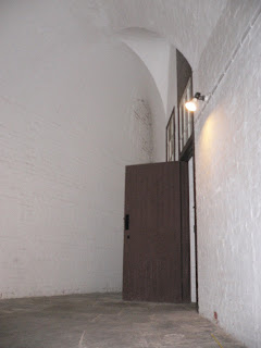
A narrow passageway led into an unusual shaped space, even for Fort Brockhurst. Starting at a point and widening, the walls led out so the room the shape of an isoceles triangle. From the apex of this triangle, the floor sloped gently down, to the base. There was no natural light, as it was a room within rooms. The ceiling was an extraordinary feat of design, arched eccentrically overhead. All these features led me to be inspired by the space. Enclosed and private, hidden and unexpected, it felt like the 'right' space. It occured to me that I haven't thought much about the right space in relation to my work before - more often it has been working with whatever was made available. This time it was different - the elements in the space itself - sound, atmosphere, temperature - became part of the installation.
Another group of artists showed at Fort Brockhurst during the Heritage Open Days this September. Gristle Mountain is an independent artist-run gallery project based in Gosport, UK. Each exhibition is shown in a place that is not exclusively an art space, such as a Fort, a Farm, a Shed, a Garage, a Field, a Boat, a Library, a Beer Garden or a small Shop. Every show at the Gristle Mountain Gallery will be based around a particular theme and be a playful investigation as to how art objects change the space they inhabit.
I was inspired and excited by Gristle Mountain's concept regarding the presentation of art objects and space. Fort Brockhurst was a powerful backdrop to their collective exhibition of drawings, entitled 'Forget Me'.
I would happily see a whole colony of artists at the fort every summer using all the little places, like the ammunition stores dug into the earth up on the ramparts, or in the gloomy cells, all of which have their own otherworldly feel. It's great to see a trend in general for artists occupying abandoned buildings and making them their own. For disabled artists, making work in response to historic buildings offers a unique point of view that does not often have the opportunity to be heard.
Wednesday 2 July 2008
It's all about the way you roll...
Here's my account of the the Tate Modern charrette on 10th May 2008.
It was great to be in the Turbine Hall in Tate Modern for a reason rather than to just pass through on the way to look at something else. I’ve always felt the space is a brilliant piece of work in its own right without any other curatorial art in it.
Talking to other wheelchair users on the day confirmed my feeling that the Turbine Hall slope is regarded as a brilliant feature to speed down in a wheelchair. There’s something very powerful about sitting at the top of that slope before swooping down it on the beautifully smooth concrete floor. To me it feels like a feature designed just for wheelchair users, as opposed to the heavy carpets and mean spaces that you often encounter in other buildings.
The day’s events made me think about how the artist Carsten Holler used the Turbine Hall. His work, Test Site (perhaps better known as the slides) let people occupy different places in that customarily serious space in a playful way. Our group had talked before about the volume of the space and how human beings occupied so little of it – as far as I’m concerned Holler nailed it when he made Test Site. YouTube has plenty of clips of people shrieking in delight as they plummet down the slide. I thought it was significant that most of the clips were of adults, as something that came out of our activity was that there shouldn’t be any age restriction on who took part.
The first thing our group did was played. We mucked about. I scooted around at top speed and Tom flew a small helicopter about in order to try and occupy the height of the space. We’d thought about mounting a lightweight camera on it to record other parts of the hall and then play them back at ground level, but regrettably, it was clear that this could not be achieved without hitting a lot of innocent bystanders.
Joolz, hell-bent on mischief, climbed one of the iron pillars by the side of the wall, chucked balls around and made a swing by throwing wool over one of the girders. The (real) security guards told him off several times (which I couldn’t help thinking he took as a measure of success…)
In the end our activity focused around some pool balls Joolz had brought along. It was all about the fun of shooting the balls out of a cardboard tube and chasing them as they gathered speed down the slope. The kinetic energy that they built up felt like a conclusive expression of my relationship to the space. We encouraged everyone present to chase the balls, which also gave the activity a nice focal point.
I wish we could have made more impact playing back our photos and film clips. We projected them through the frosted glass walls that ran the length of the education suites. The glass filtered the images in a very pleasing way. I’d have loved to be able to project larger scale films along the whole length of the walls with close-up shots of the balls rolling directly toward the viewer – possibly it would have added a new dimension to an otherwise flat wall, but hey ho, in only a few hours there was definitely potential for further experimentation.
I was delighted that another group’s activity (How quickly can you get from A to B?) used the slope as well. I’m pretty sure when Herzog & de Meuron converted the Turbine Hall they didn’t realize it would become such an exciting feature for a small section of society, but one day I hope they get to know that it is.
Caroline Cardus
InQbate workshop - The Lounge feature
Just uploaded our last issue of The Lounge, Salon's own in-house quarterly, in pdf - thought you'd be interested in a little of my own perspective on the InQbate workshop. You can read it here
Originally we were going to do a double-spread, but image copyright restrictions elsewhere put a stop to that. I'll come back with the longer article in a bit.
Feel free to ask me more about the magazine.
Monday 30 June 2008
InQbate – Brighton… My Experience by Chris Ankin
And so it was with the InQbate workshop in Brighton. I think many of us felt a degree of trepidation when we all gathered that morning, none of us knowing what design problem we were to be set, none of us really knowing what was expected of us, and I for one feeling that little element of self-doubt that I often get when faced with something new.
Part of that ‘concern’ probably came from the fact that we were to be paired with another artist, whilst I consider myself very easy going and easy to get along with, when it comes ‘our precious art’ some of us can rightly be a little non-compromising at times.
Any concerns I may have had sooner melted away however, when I was introduced to Tony Heaton – an equally easy going and easy to get along with sculptor.
We spent a good initial amount of time simply chatting to each other about our art, and comparing our thoughts – we could easily have done this for a good deal longer, there was however a design problem to address.
A Place Where Two People Meet
The InQbate space is a wonderfully large and very customisable space in which to work. It can be divided into several smaller spaces as it was on this day, or be used as one very large venue.
This flexibility extends beyond mere adjustable space size; there are many variations in lighting, sound, vision and surface space, which all combines to allow maximum variations.
After being allowed ‘introductory’ time, we were given the design task for the day, which was ‘A space where two people meet’. We set about tackling this by engaging in a joint brainstorming session.
As it turned out, we happened to have the largest area of the sub-divided InQbate space to work with. This presented us with the first decision – do we do something minimalistic and allow the extra space to add power to the work we produce, or do we utilise the area by filling it with lots of material?
Tony had a great idea of having two interlocking squares, the majority of the square being representative of the individuals entities, and the ‘mini square’ created by the interlock is the place ‘where two people meet’.
Sunday 11 May 2008
Tate Modern inSECURITY?
Really interested to see how wearing a high vis vest makes the person inside invisible/invulnerable - people just assume you are'official' and however mystifying your actions it must be OK. I've never felt so at home at Tate Modern.... Tempted to take back the outfit on another day to see how well it works on a freelance basis.
Definate split in approach in our group i felt between the artists, who wanted to work out what to do by doing it, and the architects who I think wanted to have more idea of what we were doing before it started. However, all the negotiations were part of the process to and we ended up with something we'd never have achieved individually.
Great that the Tate were so tolerant, although Marcus looked a bit nervous at times.
Steph
Monday 11 February 2008
What is a Charrette?
The charrette is a creative method for integrating the aptitudes and interests of a diverse group of people so as share knowledge and experiences, to learn from each other, to work through a specific design problem creatively and constructively, and to produce concrete examples of design improvements.
Main characteristics
Work collaboratively
All the people in a charrette are involved as active participants, with an equal role and value. Whilst charrettes can involve multiple sessions to help develop collaborative relationships, a simple form is made up of three sessions – an introductory event, where people get to know each other and agree shared goals; the design workshop itself; and a feedback process, to allow time for reflection, to share outcomes and where dialogue can be continued and developed.
Design from different perspectives
Bringing together people with diverse knowledge and experience related to the design problem set, enables a richness of outcomes, not restricted by a partial or un-informed view.
Compress designing period
A charrette speeds up the usual design process, making it intensive and ‘quick-thinking’. It also encourages people to abandon their usual working patterns and “think outside of the box.”
Communicate in short feedback loops
During the charrette, design ideas are created within sub-group based upon a shared vision, and presented within hours for further review, critique, and refinement from other sub-groups. This allows instant creative feedback to a design proposal, which can then be reviewed, changed, and re-presented for further review.
Study the details and the whole
Lasting agreement is based on a fully informed dialogue, which is best done by looking at the details and the big picture concurrently. Studies at these two scales also inform each other and can add to the creativity of the design response.
Agree intended goals
By measuring progress against a agreed set of intended goals, the design process should be transparent and constructive for all the participants
Produce a believable solution
If design solutions are resolved practically and believably (however ‘off-the-wall’) there is a level of seriousness and rigour to the process for everyone involved.
Design-on-site as a valuable collaborative tool
Design is a powerful way of enabling a shared vision. Site investigations through drawing and debate can be used to illustrate, analyse and creatively resolve the complexity of the problem set.
Working on site enables the design team to immediately grapple with both practicalities and bigger ideas; and to imagine proposed solutions easily and concretely in a real space.
Architecture-InsideOut Events News
Our latest project (funded by Arts Council SE) involves setting up a series of events which:
• Provide the opportunity for deaf and disabled artists to collaborate in exploring ways of improving the built environment
• Enable deaf and disabled artists and architects to engage creatively in developing design improvements
• Offer ‘discursive spaces’ for artists interested in architecture, and for architects, deaf and disabled artists and other associated agencies to be able to share their expertise and experiences
• Open up potential for future partnerships and continuing creative work around disability and architecture
There will be two events being planned over the next few months;
- An artists’ one-day exploratory workshop offering ‘hands-on’ involvement in creatively manipulating 3-D space, light, colour, sound, objects, layout etc., hosted by InQbate at the University of Sussex
- An intensive design workshop with selected architects hosted by Tate Modern in London. This second event – known by architects as a charrette – is an opportunity to undertake a ‘design-in-a-day’ as part of a small team of 4 – 5, in competition with up to 8 other teams. For more details of how a charrette works, see What is a Charette?.
Places are limited for phase 1 so will be offered to those whose current portfolio links closely to the built environment. We are developing other opportunities for charrettes and workshops later in the year, so please check back regularly here on the blog and the project website - currently under construction but coming soon.
Dates
InsideOut@InQbate
Two one - day workshops are planned with up to 8 deaf and disabled participants in each.
Friday 11th April 2008: 10.00 – 4.00pm
Thursday 10th April 2008: 10.00 – 4.00pm
Opening up!
Friday 25th April 2008: Introductory evening
McAulay Studio, Tate Modern, 4.00 – 7.00pm
Saturday 10th May 2008: collaborative design workshop
McAulay Studio, Tate Modern, 10.00 – 6.00pm
We hope that artists and architects will be able to participate in both these days, so that teams can get to know each other before the charrette itself.
Accessibility
The venues are wheelchair accessible and British Sign Language Interpreters will be present. Additional access requirements can also be accommodated on request.
Capturing and learning from these events
We have also asked some deaf and disabled artists to creatively capture these events, and to make a short work related to each one. As well as designs made during each event, these works will be shown on the Architecture-InsideOut website (in development) and will be publically debated via the Architecture- InsideOut blog at http://architecture-insideout.blogspot.com/
In addition, we will have a public follow-up session at Tate Modern to view these works, to discuss what has been learnt, and to make plans for future activities.
Future Developments
We are hoping to plan a series of charrettes and other events over the next year, with a first as part of the South East architecture festival (architecture08) in June.
To date we have invited specific deaf and disabled artists; for the next event we hope to make this an open submission, so if you know artists who might want to participate next time round, please ask them to contact us. We also hope to develop more projects, publicise work, related to architecture, by deaf and disabled artists, and to support more partnering between artists and architects.
Please get in touch if you would like to get involved, or would like to tell us about related projects you are working on.
Contact: architectureinsideout@googlemail.com
Zoe Partington-Sollinger (Diablo Arts)
Stevie Rice and Mandy Legg (DADA-South)
Jos Boys (Faculty of Art and Architecture, University of Brighton)